> For the complete documentation index, see [llms.txt](https://documentation.swing2app.com/llms.txt). Markdown versions of documentation pages are available by appending `.md` to page URLs; this page is available as [Markdown](https://documentation.swing2app.com/manual/maual/designtheme/prototype-ui.md).
# Prototype UI Design
**Introduction to Prototype UI Styles in Swing2App**
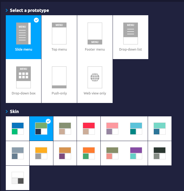
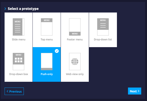
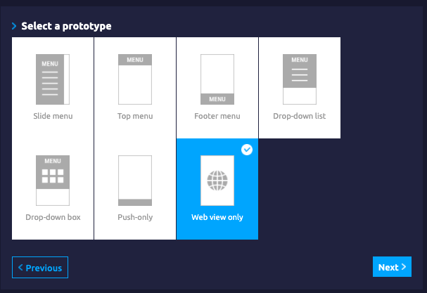
**Swing2App offers a total of 7 design styles: slides, tops, footers, drop-down lists, drop-down boxes, pushes, and web-view menus.**
Check out the manual and see the prototype app screen with each prototype design description.
**\* Prototype Singularity 1**
**If you change the prototype menu style, you’ll need to recreate your app to see the new version to reflect your edits.**
Example) At first I made a slide menu, but I want to change the prototype to a footer style.
\=Prototype is not an item that reflects the changes in real, so you must recreate the app through the app production request to reflect the changes!
**After pressing the request button for app creation, update it to soft update = \[app re-launch] and you can update without the hassle of reinstalling.**
**\* Prototype Singularity 2**
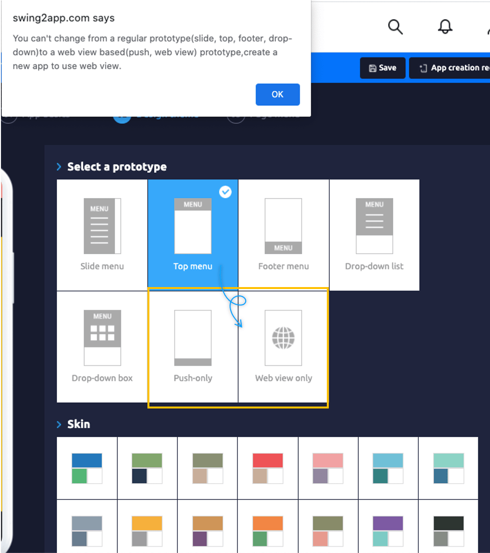
**You can’t make changes to a web view based (push, web view) prototype → after creating an app with a regular prototype (slide, top, footer, drop-down list, drop-down box).**
**\*If you need to change the prototype based on the web view, you need to create a new app.**
**Press + \[Create Additional app] button to proceed.**\
\
And likewise!
**\*After creating a web view based (push, web view) prototype → You can’t change it to a regular prototype (slide, top, footer, drop-down list, drop-down box).**
**+Regular prototypes (slides, towers, footers, drop-down lists, drop-down boxes) can be freely changed.** \\
**\* Web View Menu Features**
The web view menu has a few special features that are different from other prototype menus.
(1) Home address renewal: If you renew your home address (URL), you need to recreate your app. \*Request for App production is required.
(2) Using unlimited web view products: You can use an unlimited number of web views without paying for a limited period.
You can’t change your home address if you use unlimited items.
★Please check the manual on how to use the web view of unlimited products.
☞ [**\[For Swing2App unlimited web view use plug-in\]**](/manual/appmanage/pay/webview-unlimited.md)
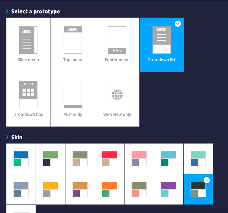
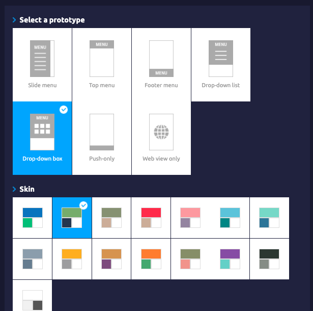
**▶ App production page – When applying the prototype in the design theme, the design is applied directly to the virtual machine on the right.**
**Check out the animated images to see how the prototype design changes on the virtual machine.**

### **1. Slide Menu**
The slide menu does not expose the contents of the categories that create the app from the beginning.
It is designed so that when you touch the sliding icon, you can see the contents of the category as the screen moves over.
**▶ App Launch Screen – Apply Slide UI**
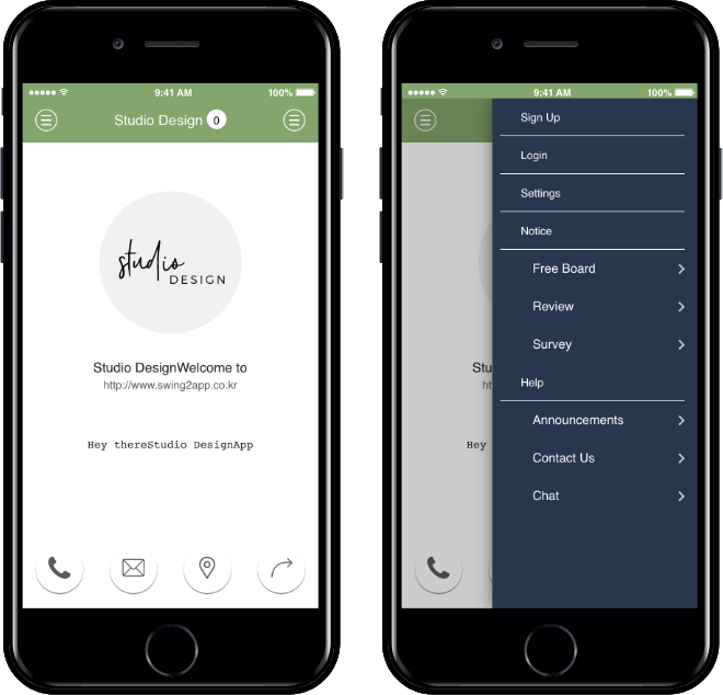
You can use it by sliding the screen, and you can select an icon to see the menu window.
\ **★ TIP to Use Slide Style**
Existing slide styles: In addition to creating menus on the right and left sides, you can also create menus either only on the left side or the right side.
After deleting the 1 menu, you can create it with the menu button on the left side or the right side only.
**Image Reference)**\\
**★How to use**
Maker(V2) page> Design theme → Prototype: Select slide> Page menu →**Delete all right or left sub-menu**→ Save → Request app production
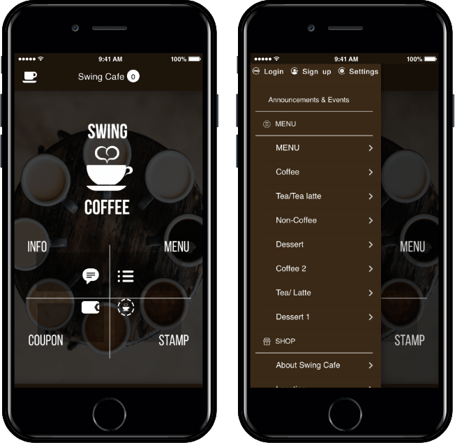
### **2. Top Menu**
In the top menu, **categories, bulletin boards, etc.,** are located **at the top** of the **home screen**.
When you touch the menu, the categories corresponding to the menu are displayed on the entire screen.
**▶ App Launch Screen – Top UI**
In the Top Style, **you can check the subcategory contents by selecting the menu located at the top**.
You can easily check the entire menu at a glance.
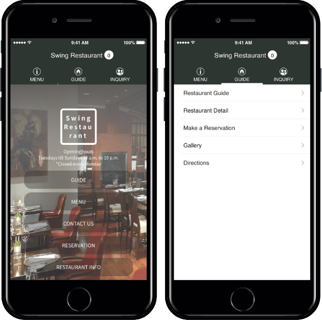
### **3. Footer Menu**
The footer menu is located at the bottom of the home screen.
Click the icon to expand the contents of the category across the phone screen.
**▶ App Launch Screen – Apply UI Footer**
In contrast to the top menu, **this menu is located at the bottom.**
Selecting the same category opens a sub-category.
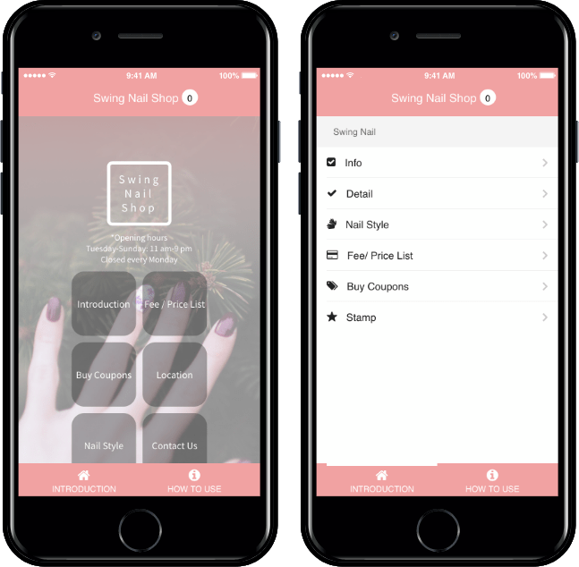
### **4. Drop Down List Menu**
The drop-down style is a style with one top menu, **cascading menus, and categories.**
**▶ App Launch Screen – Apply Drop-Down UI List**
**The drop-down cascades the sub-categories when you select the parent menu.**
You can organize multiple menus and categories, which can be useful if you need to put a lot of menus in your app.
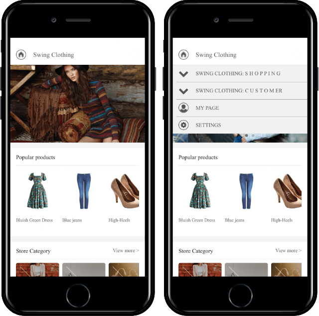
### **5. Drop-Down Box Menu**
‘Drop-down Box’ is the same as the ‘Drop-down List’ prototype, and only 1 menu is shown at the top of the home screen.
**When you select a menu, the box-shaped square sub-menu opens.**\\
**▶ App Launch Screen – Apply Drop-Down Box UI**
**The drop-down box opens up a square sub-menu when the top menu is selected.**
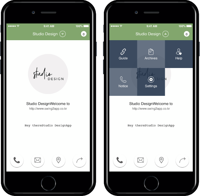
### **6. Push Menu**
Push styles are styles that move your mobile website to your app.
The push-only prototype design gives you the freedom to send push, and the bottom of the screen category menu makes it easy to move around the app.\\
**▶ App Launch Screen – Apply Push UI**

Use the Navigation Bar at the bottom to go to the previous step, the next step, and the home screen.
Click the bottom push settings button to turn on or off the push notifications.
**★** [**\[Super Simple! Go to the Push Version App Production Manual\]**](/manual/maual/appbasic/push-webview.md)
### **7. Web View Menu**
The web view is also a method of moving a website to an app in the same way as Push.
**\*The app does not create a separate menu or icon and does not send push.**
**Use the app as a menu and category for the site you entered.**
.
**▶ App Launch Screen – Apply Web View UI**

Since the web view has left the website itself in the app, the app design is very neat and easy to create.
If you have a mobile-only site, you can create a mobile-optimized app.
**★** [**\[Super Simple! Go to the Web View Version of the App Production Manual\]**](/manual/maual/appbasic/push-webview.md)
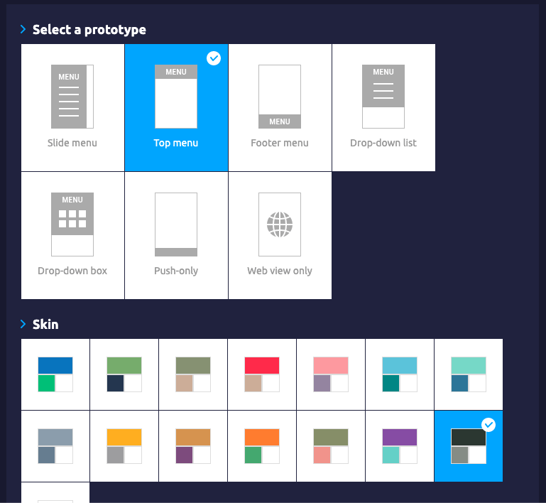
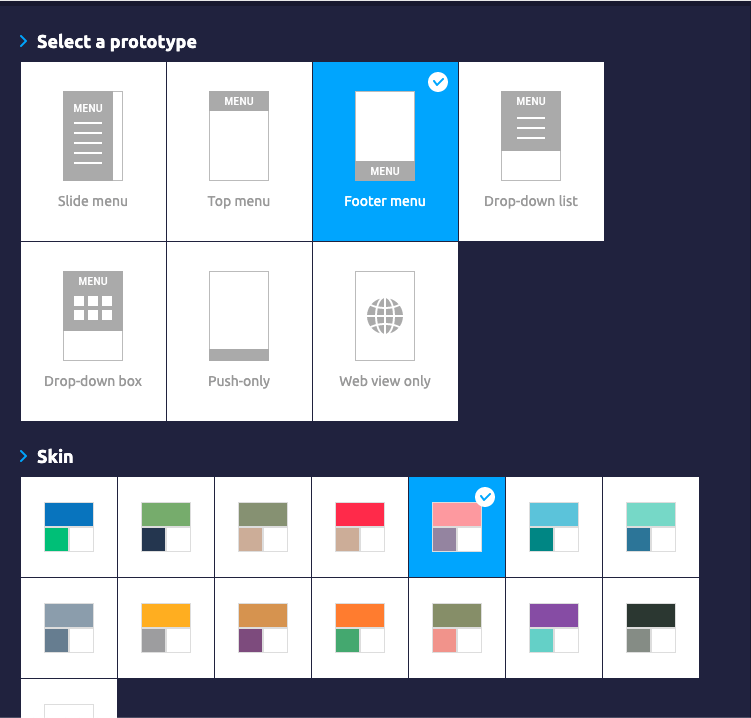
**The prototype can be set up on the \[Maker(V2) Page – Design Theme].**
**Feel free to create your app through a variety of prototype designs.**
**After selecting the prototype, you can also set the skin color to whatever color you like.**
**The design theme is immediately reflected through the virtual machine on the right, so please compose the design theme with the content that matches the app.**