> For the complete documentation index, see [llms.txt](https://documentation.swing2app.com/llms.txt). Markdown versions of documentation pages are available by appending `.md` to page URLs; this page is available as [Markdown](https://documentation.swing2app.com/manual/maual/designtheme/navigation-styles.md).
# App Navigation Styles
**What is App navigation style?**
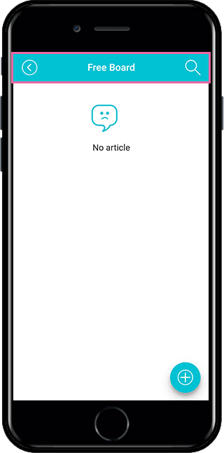
Navigation is the Bar area where the app menu name is listed.
Look at the image. When you **move the menu applied to the app, like the image you attached, you will have a Bar with the menu name on top.**
**That area is called navigation.**
**App navigation style is a function to configure the design by setting options to the style you want in addition to the navigation style set in Swing2App.**
In the past, when you selected a prototype from a design theme and set the skin color, it would look like it was set into an app just as you typed it.
Adding this feature allows you to place an image in the navigation area, or shade it to make it look transparent.
\*The app navigation design style is not a required feature, but an option. It’s optional! Please check and apply the style you want.
**★ How to use the app navigation Style**
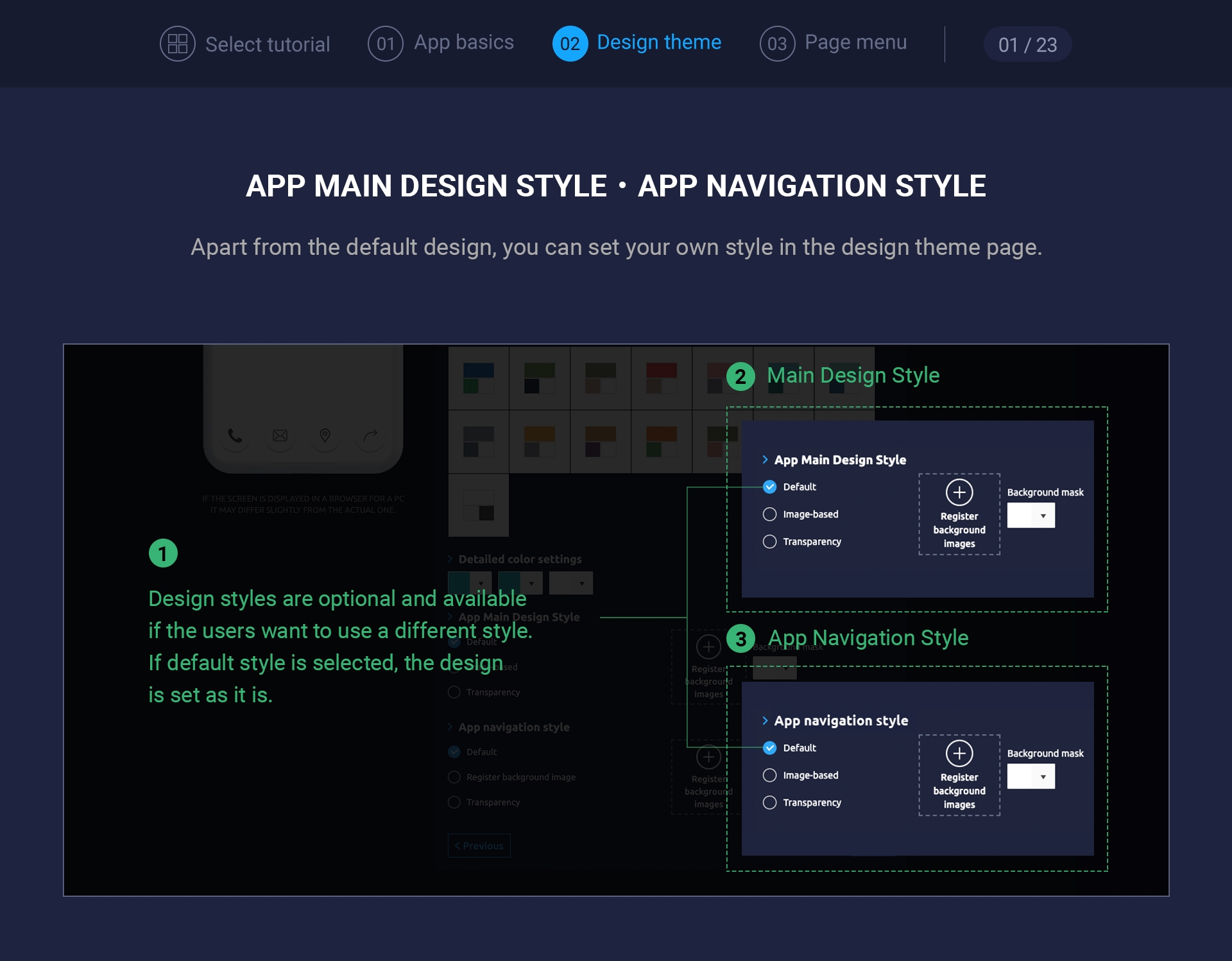
**App navigation design styles can be found at the Design Theme stage.**
**You can select a prototype, choose a skin color, and then check it out.**
**These features are not required but are optional, so you don’t have to apply them.**
### **1. App Navigation Style – Default**
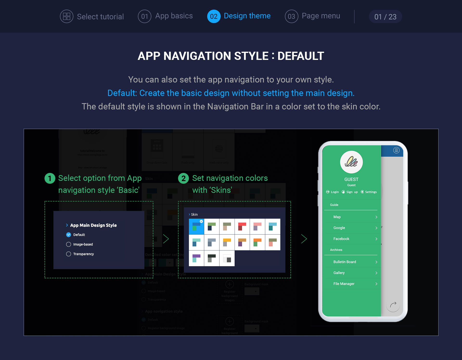
**If** you check **\[Default]** other styles will not be applied, and the styles set in the design theme will be applied.
If you set the skin color to blue, the navigation will also be shown as a blue color.
If you want to make a default style, please check ‘Default’.
### **2. Navigation App – Register background image**
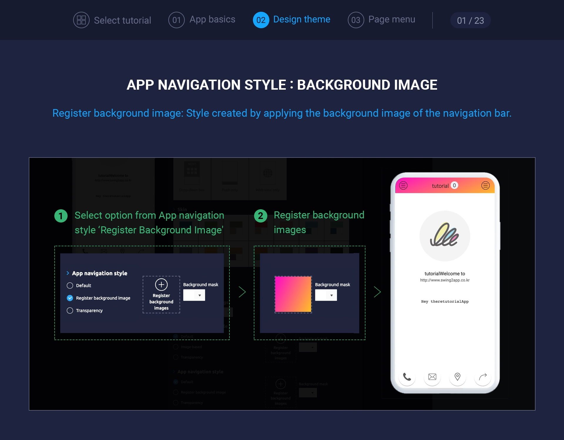
If you select \[Background image registration], you can register background image in navigation.
Please register your image as an attachment.
When you add an image, the background image is displayed on the navigation area as shown in the attached image.
**★ There is no recommended size for background image for app navigation.**
**When entering the navigation area, it is adjusted to a pixel size of 360 px(horizontally) \*56 px(vertically) around the center background of the image.**
When inserting a navigation background image, it is recommended to insert an image in a pattern format.

(Example of background image)
**If you put a normal background image and it doesn’t fit properly, the image will be split or will be cropped.**
**Therefore, even if the image is cut off, it is recommended to insert an image with an unrelated pattern style!!**
### **3. App Navigation Style – Background Image + Background Mask**
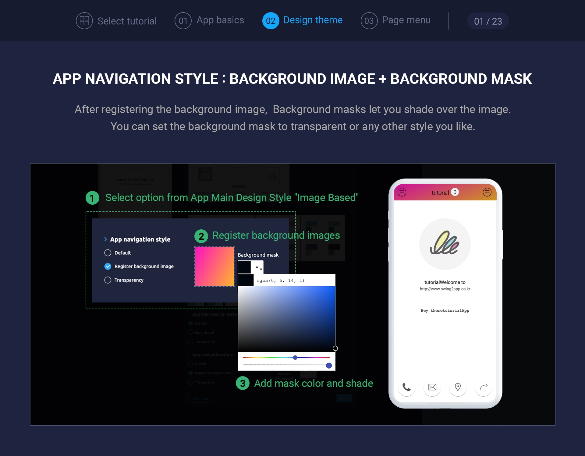
Let’s apply \[Background Mask] to the image selected above.
**The background mask is simply shaded.**
**It’s shaded on top of the image.**
You can set the degree of shade and shading by selecting a background mask, selecting a color, and setting transparency.
If the image and background mask are applied together like the image captured above, it will appear with orange shade color on the background image.
For normal shading, if you have a background image and the text is hard to see, you can darken it to make the text look better.
\[**Please check the app main design style setting method]**
**☞** [**How to set up the app’s main design style**](/manual/maual/designtheme/main-designstyle.md)